When an individual is diagnosed with dementia, it can be a difficult time, but many want to maintain their independence as much as possible. Dementia can cause uncertainty, confusion and memory loss, and many will also experience difficulties with their sight and perception as a result of both their condition and their age.
The right environment can make a huge difference and help those with dementia stay safe while providing aids that help them navigate their surroundings.
Fortunately, there are plenty of these aids available. Specially crafted signage, wallpaper and murals using dementia-friendly colours can help you cater to the estimated 850,000 people in the UK with dementia.
Why Is It Important to Use Dementia-Friendly Colours?
Before we look at why it’s important to use dementia-friendly colours and the importance of contrast, we must first understand how colour is defined.
Colour is dependent on three different values:
Hue: This is what we would refer to as the colour — if someone asked you the colour of a phone box, for example, your first instinct would be to say “red”. The hue may be a primary colour, such as red or yellow, or a secondary colour, such as orange or purple.
Value: This is how light or dark a colour is. Lighter colours are referred to as “tint” because white is added to them, while colours that have black added to them to make them darker have a lower value, known as “shade”.
Chroma: This is the vibrancy or purity of the colour. Primary colours are the purest — or most saturated — because they have no other hues added to them, while a light yellow-green colour will have less saturation, being a combination of yellow, blue and white.
So why is the composition of a colour important? As we age, our eyes naturally deteriorate, leading to the need for additional light, increased sensitivity to glare, reduced peripheral vision and even an altered perception of colour. This means that an elderly person may find it difficult to differentiate between less-saturated or “washed out” colours, such as a light red-orange and a light yellow-orange.
It’s clear that these individuals will perceive their surroundings differently. When an individual has dementia, though, using contrasting colours becomes even more important.
How Are Dementia-Friendly Colours Used?
Those with dementia may find it difficult to perform familiar tasks or keep track of things and can become easily disoriented. By using dementia-friendly colours to mark out key areas and features; commercial establishments, care homes and those looking to make an individual’s home easier to live, and be independent in can support people to find their way around and use facilities unassisted.
Highlighting Hazards and Risks
Contrasting colours can be used to highlight potential safety hazards to those with dementia. Changes in hue or value can indicate a change in floor level, so by using dementia-friendly colours — bright and saturated colours that contrast against one another — you can show where a surface changes from a flat floor to steps, either by having stairs in a different colour or using a contrasting stripe at the foot of the staircase.
Contrasting colours can also be used to highlight sharp edges. Coloured shelves can help users find objects while preventing nasty bumps and scrapes. Likewise, using a different colour for cabinets or tables can not only help users navigate their surroundings but also prevent accidental injury. There are some areas or objects you may not want to draw attention to — we’ll cover those later on in this post when we discuss where you might not want to use contrast.
Highlight Key Areas and Important Elements
Just as dementia-friendly colours can be used to highlight potential risks, they can also call attention to important areas or objects.
You might want to use contrast to define the edges of plates and dishes by using rubber mats or coloured crockery, which can be useful for those in a care home or independent home setting. You can also use coloured doors to highlight the entryway into a new area. Using a different-coloured door or door wrap for the bathroom, for example, can help people identify where they need to go without support. When using coloured doors, also consider having door handles and knobs in a contrasting colour to help people identify them.
You can also use dementia-friendy colours to add clarity and help with positioning by marking out chairs and other furniture and toilet seats and sinks in different colours to the wall and floor.
The aim is to always contrast: use a starkly different colour — consider using different hues and high-chroma colours, rather than the same colour in a different value — to separate switches, fixtures, handrails and railings from the walls they sit on.
Design studio Boex was commissioned by a healthcare facility to design a dementia-friendly living space. Designed to promote wellbeing, calm and domesticity, the space uses brightly coloured furniture that contrasts with the walls to help users move around it. Note how the light fittings contrast to all other colours used in the room to highlight the features and how the floor is simple and consistent to indicate a flat level.
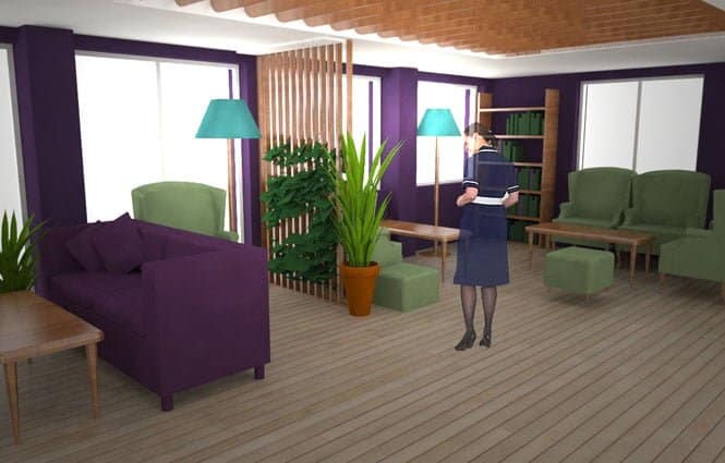
Image from Boex
When using dementia-friendly colours, it’s important to consider how you use contrast to highlight features versus hazards. Using the same colours to determine both could cause confusion and inadvertently lead to those with dementia or poor sight mistaking hazards for features. People also may not remember what each colour represents — in this case, it can be helpful to use other visual cues, such as dementia signage.
At Banner World, we stock a range of signs in bright colours designed to be easy to read. Bathrooms, kitchens, living rooms and bedrooms can be signposted to prevent stress and disorientation in people with dementia when navigating their surroundings, whether they live in a care home or their own home.
Improve Mood
We know of the power of colour in improving mood — doctor’s offices notably use colour very specifically to reduce anxiety and provoke feelings of calm. Dementia can cause changes in mood and behaviour and those with dementia are as much as 40% more prone to depression and general feelings of apathy.
It’s important to look out for signs of depression in those with dementia, including increased agitation or a loss of interest in activities they once enjoyed, but you can use colour to help alleviate their mood. Consider colour associations when choosing which colours to use to call attention to features and hazards — blue can make a room feel bigger and provoke calm, making it an ideal colour to use in bedrooms or communal spaces. Red, on the other hand, increases adrenaline and brain activity and has a natural association to danger — consider using this to highlight a change in floor level or sharp objects.
You don’t just have to use colour to mark out objects, though. Murals can be used to provide a sense of familiarity, reduce disorientation and enhance the environment for dementia and Alzheimer’s patients. This is especially useful for helping those new to a healthcare setting, who may find it difficult to adjust. Our dementia-friendly pub mural, for example, could be used in communal living areas to signpost the space, provide stimulation and encourage social interaction. Our bookcase mural, on the other hand, could be used in quieter areas or in bedrooms to provide a relaxing space where a patient can enjoy a book or engage their brain by completing a puzzle or crossword. Shop-front murals, ranging from a bakery to a barbers’, can transform sterile and drab corridors into a colourful high street, encouraging conversation and providing patients with a sense of independence.
When Not to Use Contrast
Dementia can cause a patient to lose touch of where they are what they’re doing, especially as it progresses. To minimise the risk of an individual wandering off and getting lost, which can cause panic and disorientation, you can use low contrast to block off restricted or potentially dangerous areas.
While you’d use contrasting doors to highlight bathrooms and bedrooms, you might not want to use a bright yellow door as the entry to a staff room, storage area or exit door. Instead, use neutral colours or adopt the same colour as the wall so that exit paths recede into the background and don’t stand out.
You’ll also want to avoid using objects with too many colours. Heavily patterned carpets or chequered rugs can be perceived as a change in floor level or an obstacle, and those with dementia will find it more difficult to navigate. Instead, stick to using blocks of colour or graduate the colour change slowly to prevent a sudden contrast, which can cause unsteadiness and even falls. In the same vein, having flooring in contrasting colours in different rooms can be perceived as an elevation change, so where possible, ensure that areas that lead onto each other use the same colour so that an individual with dementia knows it’s a level surface. Only use changes in colour to indicate ramps or steps.
Contrast is the key to providing a safe and enjoyable environment, helping those with poor sight or dementia continue using spaces with as much independence as possible. By making simple yet effective changes, whether in an establishment or a home, we can make sure that those with dementia can make sense of their world and function with confidence.
Are you interested in finding out more about our signage and wall murals in dementia-friendly colours? Check out our range of dementia-friendly murals, signage and door wraps and make your healthcare setting a more enjoyable and navigable environment for those with dementia. Get free delivery on orders over £250.


Leave a Reply
You must be logged in to post a comment.