In this blog post, we’ll explore the limitations of matching RGB colours to CMYK, helping you understand the challenges and considerations involved in colour conversion. This blog also serves as a tool to help manage your expectations of our printed products.
As our lives become increasingly digital, more artwork is being created and delivered in RGB format. While this opens up a vibrant spectrum of bright and captivating colours on-screen, it also presents challenges. Many of these colours cannot be accurately reproduced using the traditional CMYK four-colour printing process.
When working with a design agency or graphic designer, it’s crucial to select brand colours that translate well both on screen and in print. Most major brands carefully choose colours that maintain consistency across all media.
As a leading banner printing company, we aim to set clear and realistic expectations for the final product.
What are RGB and CMYK Colours?
When we design graphics and images on a screen, we see colours in an RGB colour spectrum using LED light. RGB stands for Red, Green, and Blue. These colours can look bright and vibrant on our monitors.
However, large format printers use CMYK inks (Cyan, Magenta, Yellow, and Black) instead, which can’t reproduce every colour we see on a digital screen.
Colour Gamut and Output
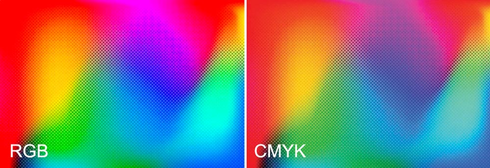
RGB colour has a wider colour gamut (Colour Range) than CMYK colour. This means RGB can display more vibrant and saturated colours that are outside the range of what CMYK process inks can reproduce.
In practical terms, when we prepare images in RGB and convert them to CMYK for printing, some bright colours, such as neon greens or deep blues, cannot be reproduced exactly with ink. The colours will appear duller. There is no escaping this colour shift.
The printable colour spectrum in CMYK is smaller, leading to less vivid or duller output in some cases.
List: Colours Affected by Gamut Limitations
- Bright greens
- Bright cyan blues
- Oranges
- Deep blues
- Intense reds
While we can adjust files to improve colour matching, such as using colour management tools or adjusting the colour profile, the underlying difference in colour gamut limits the perfect reproduction of all RGB colours in large-format printing.
This is one of the main technical reasons printed pieces do not always match their on-screen appearance.
The most important thing to know is that not all RGB colours can be perfectly matched when printing in CMYK, so printed materials may look different from what we expect. Some bright blues, greens, and oranges may lose intensity, appear dull, or shift in tone.
A dullness in colour appearance is a normal limitation of the printing process, not a mistake.
Knowing the limitations between RGB on screen and CMYK in print helps us set realistic expectations and make better design choices for our print projects.
We can plan ahead to avoid surprises and get the closest possible colour results in our large format prints.
The Differences Between RGB and CMYK in Large Format Printing
RGB and CMYK use different methods to create colours, which leads to noticeable differences in colour output and reproduction.
These differences affect how closely printed colours can match what we see on digital screens.
RGB – CMYK Comparison
Additive and Subtractive Colour Spaces
RGB is an additive colour space. We create colours by mixing red, green, and blue light. When we combine all three colours with full intensity, we see white. This colour method is standard for computer screens, smartphones, and digital cameras.
CMYK is a subtractive colour space used in large-format printing. Here, we use cyan, magenta, yellow, and black (K) inks.
Each ink subtracts or absorbs certain wavelengths of light. When mixed, these inks create darker colours, eventually making black when combined in full.
The difference in colour mixing means that the same colour values can appear differently depending on whether we use light (RGB) or ink (CMYK).
Matching Colours to RGB Colours in CMYK Printing
Matching colours from an RGB colour space to CMYK printing presents several challenges.
These issues affect the accuracy, appearance, and consistency of printed materials across different surfaces and devices.
Consistency Across Different Materials and Devices
Achieving consistent colour reproduction across paper types, printers, and batches is another challenge.
Coated and uncoated papers reflect and absorb inks differently, which alters the final appearance.
For example, coated substrates like banner material provide crisper, more vibrant results, while uncoated items like fabric produce softer, less intense colours.
Each substrate interacts differently with CMYK inks, impacting colour matching.
The same CMYK file will appear differently when printed on two different types of substrate.
Conclusion
While RGB offers a vibrant and expansive colour range, it’s not always possible to achieve the same colour using a CMYK format. The limitations of CMYK lead to less vivid output on vibrant colours. By being aware of these constraints and planning accordingly, you can make informed design choices that ensure your printed materials closely match your vision. At Banner World, we are committed to helping you navigate these challenges and setting realistic expectations for your final printed products. This knowledge empowers you to avoid surprises and achieve consistent, high-quality results across all media.


Leave a Reply
You must be logged in to post a comment.