Colour Matching Pantones with CMYK: A Step-by-Step Guide
Colour-matching Pantones using a CMYK process can be challenging for designers and printers alike. Pantone colours are widely used in the design industry to ensure consistent and accurate colour reproduction across different media. However, when it comes to printing Pantones using a CMYK process, it can be difficult to achieve the exact colour match. The main difficulty is CMYK is a subtractive colour model, while Pantone colours are based on a different colour system.
When printing Pantones using a CMYK process, designers and printers need to consider the limitations of the CMYK colour model. CMYK uses a combination of four colours – Cyan, Magenta, yellow, and black – to create a wide range of colours. However, it cannot accurately reproduce certain bright and vibrant colours. This is where Pantone colours come in handy, as they offer a wider range of colours that can be difficult to achieve using CMYK alone.
What is a Pantone colour?
A Pantone® colour is a colour reference from a Pantone® chart. Pantone® is a trading name, and Pantone® is the printer industry-standard go-to colour guide for the print and graphics industry. Pantone® provides colour booklets with solid colours that can match colours on printers. The booklet is simply a colour communication tool between print houses and graphic artists.
Because the chart is a physical printed booklet, each print house refers to a Pantone® booklet for reference. By quoting a colour reference from the book, another print house can look up the colour and use this reference to make the best match. The print operator can then adjust the CMYK colour setting to replicate the colour as closely as possible. The Pantone® matching systems have limitations which we will discuss in these next sections.
Why use a Pantone?
The Pantone system is a booklet of standardized colour swatches identified by a unique number for each colour. These colours are created using a specific ink formula and printed as a solid colour rather than created through a combination of different colours.
One of the key advantages of using Pantone colours is that they are consistent across different printing processes and materials.
What is the CMYK process?
The CMYK process is a four-colour printing process used to reproduce colour images.
The four colours used in the process are:
Cyan (C)
Magenta (M)
Yellow (Y)
Black (K)
These colours are combined in different proportions to create various colours. The CMYK process is also known as four-colour or process printing.
The CMYK process is used in commercial digital printing and other printing applications. It is a cost-effective way to reproduce colour images but has some limitations. One of the limitations is that it cannot reproduce certain colours accurately, such as bright blues, oranges, violets and greens.
Can we match all Pantones using a CMYK process?
No, we cannot match all Pantone colours. Some Pantone colours are impossible to match due to colour gamut restrictions using a CMYK process.
We can match around 85% of Pantone & Spot colours using a four-colour CMYK process. However, some Pantones, including bright colours, are usually unachievable using a CMYK print process. Very intense bright colours like blues, orange, lime greens and violets are sometimes unmatchable using a CMYK print method.
Why do we print using a CMYK process?
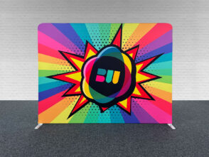
CMYK process is the industry standard in large-format printing. All full-colour banners etc., are produced using the CMYK system.
The CMYK print process allows us to print various colours quickly and cost-efficiently.
Challenges of Colour Matching Pantones using CMYK
Colour Matching Pantones with CMYK process can be challenging. While matching most Pantone colours using CMYK is possible, it is important to understand that the two systems are different, and a 100% match is not always possible.
One of the biggest challenges of matching Pantones using CMYK is the limited range of colours produced using a four-colour process. Pantone colours are created using a specific ink formula, while CMYK colours are created by combining four inks: Cyan, Magenta, yellow, and black. Some Pantone colours cannot be reproduced using the CMYK process.
Another challenge of matching Pantones using CMYK is the variation in colour output between different printers and printing processes. The same CMYK values can produce different results depending on the quality of the printer, the type of paper used, and the printing method employed.
How much does it cost to match a Pantone?
Achieving consistent colour matching across different print projects takes time and effort. Pantone matching is a time-consuming process. If you require Colour matching, please inform us when placing your order. Colour matching will incur an extra fee of £30+vat per colour. Before we colour match, we will take a look at your artwork. We would then advise and, if so, send an additional invoice for any requested colour matching.
What colours are difficult to Pantone match?
When Colour Matching Pantones with CMYK, we’ve mentioned vivid colours like Blues, greens, violets and oranges, which in some instances are unachievable to gain a correct match.
Other colours that could be more problematic to match are greys and creams. Grey, in particular, is a questionable colour. When printing grey or cream, it is always safer to quote a Pantone® reference.
Grey is a shade and can be produced from a mix of all the CMYK base colours. All colours can be present in a grey colour, not just Black. The reason that grey is so tricky to match is as follows:
A touch of Cyan removed – 1-2% could have a massive impact on the colour hue of the grey and make it much colder in shade.
The same effect will happen if print software translates the grey slightly warmer and adds slightly more Magenta (redder) to the colour mix. The result could be an overly warmer grey.
Can you print metallics?
It isn’t possible to produce metallics using a four-colour process. We only print from a CMYK mixture of colours. Metallic colours may only be produced from a specially formulated metallic spot colour.
What if you can’t match my Pantone colour?
We will use the nearest possible alternative if we cannot match your Pantone. Some vivid colours will appear more muted and duller than the Pantone they represent.