How to create a logo and why it’s so important?
How to create a logo and why it’s so important? So what does it take to create a recognisable brand? In this blog will discuss your brand which is a very important subject. Your brand is the visual face of your business, and it’s what a customer sees when they visit your website, shop or store. Branding is very important, and when creating a logo, you should take time and consideration to do this. So much thought needs to go into creating a stand out logo and brand, and you should be mindful of many factors when deciding on the best logo for your brand. In this blog, we discuss the best path for creating a killer logo and brand with some important factors to consider when deciding on the best logo for your needs. Be it the colour, the typeface or the icon. Your logo shouldn’t be a 5-minute wonder, and you need to take time when deciding on a design which will be promoting your products and services for many years to come. Once your logo and branding have been identified as your company’s visual connection, it will be difficult to change it in the future, and also expensive. With this in mind, it would help if you chose a design that is fresh, easily legible and timeless. So let’s start with explaining the process of creating a brand which will take you and your business to the next level.
Create a logo with a good impression
So why is Creating a recognisable brand logo and why it’s so important? In a visual sense, humans DO judge a book by its cover, and we are curious by nature. Whether it be the packaging of the latest toy when you were a kid or seeking out someone to take on a hot date in your teens, the initial trigger is a visual attraction. The same goes when creating a brand. You need to identify an attractive way to engage a potential customer. A logo is a selling tool, which should engage the viewer instantly. Depending on what you are selling will characterise how you design your logo. Each industry will have more suitable colours and a style which will suit more your sector or industry. You wouldn’t design a logo for a kids nursery the same as you’d design a logo for a restaurant chain.

Visual identity
How to create a logo thus creating a visual identity? There is much more in a logo that just a text and a nice emblem. Have you ever looked at a logo and been instantly drawn towards it? What happens when we look at a logo for the first time? When our eyes see a logo for the first time, the receptors send signals to the brain, which processes the look and feel of the logo. This recognition happens all within a split second, and your brain instantly registers an emotional response to what it’s seeing. That response could be positive or negative, giving feelings of happiness, warmth, care or unease.

Our eyes create feeling towards a brand
How we feel is our brain’s reaction to external stimuli. How we create a logo says more about a brand than we realise. Our brain is a structure so amazing and so powerful that we only use 10% of its capacity. Our internal supercomputer has evolved through millions of years of evolution, and the human brain is the most complex structure in the known universe. It takes a lot of powering with the human brain using 300 calories per day to function, creating enough electricity to power a low wattage light bulb. Our brains are so quick with waves of electricity running to our neurons at the speed of light. The speed at which our eyes send signals to the brain to promote a reaction is nearly instant. It’s these quick reactions that have enabled humans to survive and keep out of danger throughout evolution. When light from an image comes into contact with the eye, the process of decoding the visual begins immediately. What’s impressive is the speed at which this happens all in less than the blink of an eye.

Visual response to shapes colours and typefaces
Understanding the process of how our brain and eyes work to create an emotional response towards a logo is very important. Our eyes help us navigate the world of emotion and what we see will depict how we feel. The colours red, yellow and orange create feelings of warmth and comfort while shades of blue, creating the feeling of cold, calmness and non-threatening. Lettering styles trigger different feelings in the viewers. A Serif font creates a feeling of quality and respectability, while rounded fonts can add a sense of fun and lightheartedness. Script type, on the other hand, creates feelings of elegance and femininity. Different shapes will create a range of emotional responses. Squares show stability while circles create a feeling of wholeness and harmony. We associate diagonal lines with action or movement as we run facing slightly forward, and a horizontal line we make a connection to a horizon. In contrast, a vertical line could create a feeling of structure as trees and buildings stand upright. A semi-circle depending on the way it’s used show the vision of a smile, sadness, a rainbow or sunrise.
Create an attractive logo
When a new customer sees your logo for the first time, they should be able to look away and draw a rough layout of what they have seen.
The best logos are ones which attract the eye and instantly and create intrigue. Logos should allow the person to delve a little deeper, creating the desire to know what you are selling. If you think of famous logos very few, actually have a connection to the product in the name or emblem. You might be thinking, well that’s wrong, and yes some logos do have a connection, for example, Pets at Home, Carpet World etc. Most of the big player’s logos don’t give you a clue about what they are selling. It’s crazy to think that if you’d never laid eyes on some of the world’s most famous logos before you wouldn’t actually know that that company was selling. Here’s a list of companies with logos that don’t have a connection to a product or service.

Recognition
What makes this so interesting is our instant recognition of big brands. Your brain instantly connects the dots upon seeing the apple icon, which means that a good logo should create recognition. As most companies start small before a famous icon or emblem were instantly recognisable, it’s important to think of adding an explanation of what you are selling. For example, Apple started as Apple Computers Inc, which explains the product. Over time they are now of the largest companies in the world we now only know them as Apple. Apple is that big now that they do not need to explain their offerings.
If you are creating a brand be mindful on how your logo can be developed in the future, you never know you could be creating the next Amazon or McDonald’s.
Create a timeless brand
There is more to creating a timeless brand than meets the eye. Large well-known companies do rebrand from time to time. However, the changes are minimal, meaning that the logo, even in its facelifted format, has a strong connection to the original. Having a deep connection to the previous brand is very important, and there is a need to see a clear connection so as not to confuse returning customers. You should choose a logo that can, over time, evolve. Bear in mind when choosing a logo and brand of how you can adapt your logo in the future to keep it fresh and up to date. Here is a timeline of the famous Coca-Cola logo showing how it has developed over time to the logo you see today.
The basics of creating a logo
Your logo lets potential clients and returning clients alike recognise you and your company. Your logo needs to grab the viewers attention and be easily recognisable within 2 seconds. Depending on what your business is, or what service or product you are selling will depend on how you choose your perfect logo or brand. Your logo should be easy to read and easy to understand and pronounce. Simplicity is key. If you wish to have an emblem which accompanies your logo, make sure that keep this simple and eyecatching. Another very important point to consider is how your logo will be reproduced. Make sure that you use colours that can easily be replicated in CMYK.
Colours
As discussed earlier, you need to choose colours that represent your product and services. Choosing a colour scheme is extremely important to the design process. Less is more even in the colour department with many famous logos using most commonly one or two colours. When you think eBay who you instantly imagine their multicoloured logo even so their logo is only four colours.
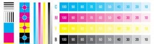
Ok so you’ve chosen an eyecatching colour scheme but how does it stand up in the real world. CMYK is an industry-standard print colour process, so your logo needs the ability to look good in standard printing CMYK colours. If you are employing a designer, make sure that your logo works well and appears vibrant in CMYK. Using a file originally created in RGB (screen colours) can create dull washed out colours when converted to CMYK. Choosing a Pantone colour is a good idea for keeping colour consistency. Pantone is a recognised colour matching system which enables print companies to match colour from a physical colour chart booklet. When choosing a Pantone, again make sure that this colour replicates well in a CMYK format and if you are unsure speak to a local print shop for advice. Also is worth considering how your logo will appear when shown as vehicle livery, a printed PVC banner or a display or printed Gazebo.
Vibrancy
A brand and logo should be vibrant and enjoyable to the viewer. Bright, eye-catching colours are always well received and are used more commonly than lighter paler shades. Brighter, more vibrant colours will create a feeling of activity and energy. There are very few famous logos which are created in the colour brown and for obvious reasons. There are though exceptions to using brown with coffee shops and chocolate companies being the most common. Vibrancy is important when creating a logo that is full of energy and life. Even if you like paler, less punchy colours create a brand which is vibrant from a design perspective.
Logo Proportions
Proportions of your logo are very important and should be scrutinised when in the design stage. You don’t want a logo too deep in height or at the same time too long and thin. Look at other well-known brands and get a feel for the proportions of the logo. Choosing a well balanced proportioned logo will make it much easier at a later date when you are ordering items like printed banners or creating a design for vehicle livery as the logo will fit better in the given space.
Logo Scale
Logo scaling is also an important factor when creating a logo. Make sure when you are designing or if employing a designer that you create a logo that can scale to any size. Creating a logo in a vectored format is highly advised as this will enable you to scale to any size without distortion. Many web designers create logos in pixel-based programs such as photoshop, this should be avoided, and if a designer advises you that this is correct, you should look elsewhere. For more information on vectors, then please read this story on the benefits of using vector graphics.
Consistency is key
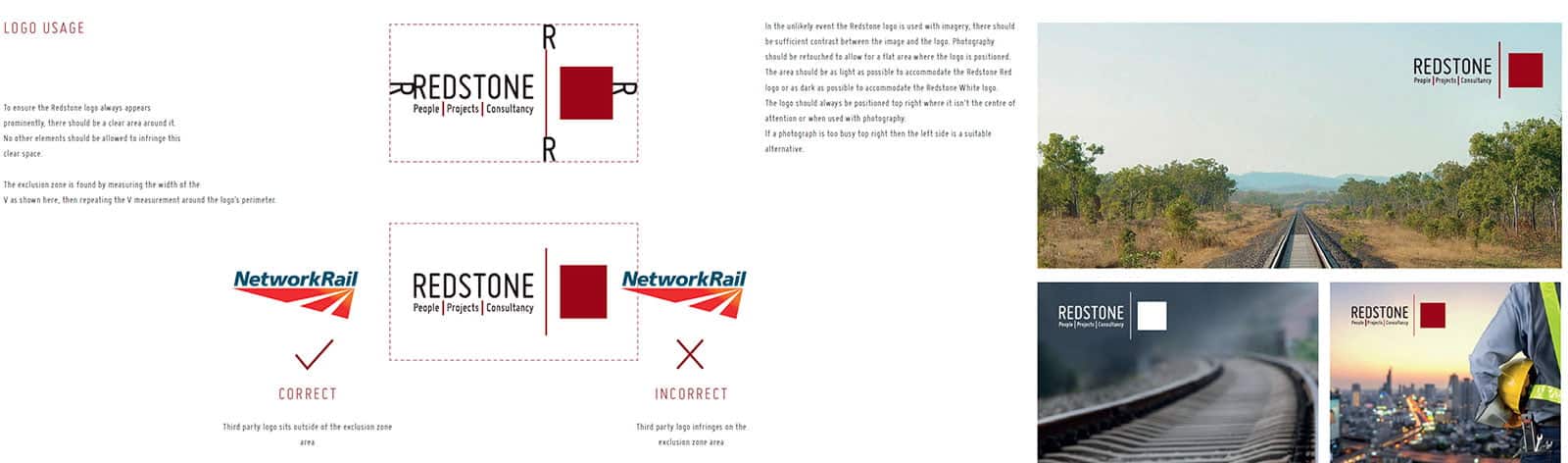
Consistency is the key to keeping your brand together. Creating a simple brand guideline catalogue showing your logo in different situations is always a good idea. A Brand guideline is a list of visuals cues showing how your logo shall be placed on different types of marketing mediums and is a good way to keep your branding house in order. You can include a page which shows your colours and Pantone references. It should have a section showing your logos and emblems, and it’s not unusual for a logo to have a range of two or more variants, for example. One could have the emblem above the wording. Another could have the emblem left-hand side of the wording. It’s always an idea to do a monochrome version of the logos showing in black and white or greyscale. A simple Black and white version is very useful for adding to corporate paperwork, contracts and terms and conditions. When creating brand guidelines, it’s a good idea to have a do and don’t section is your branding guidelines. Use a tick to show the correct use and a red X to show incorrect usage of a logo. Using correct and incorrect examples shows clearly how your logo shall be used. Adding clear instruction to your guidelines gives future subcontractors who create artwork on your behalf clear and concise instructions on how to showcase your brand.
Getting started creating a recognisable brand
From reading this blog, you should now be well on your way to understanding what you need to think about before you start creating a logo. The post hasn’t been written from a designers perspective but for an individual who requires information on what it takes to create an effective and recognisable brand. Hopefully, now you will be looking for the services of a graphic designer, and you now understand what it takes to produce a recognisable brand.
Dealing with a Graphic Designer
A graphic designer will usually have their own, unique style. If you don’t agree with their proposed design, it’s not unusual for them to sway your thinking towards agreeing to their proposals. Should you trust what your graphic designer advises? That’s a hard question to answer; however, from experience, I go with a strong gut instinct, and if I disagree with the proposal, I’ll take the time to explain my concerns and ask for an alternative design.
Why do graphic designers try and sway your approval? Firstly it’s an easy day at the office, and the quicker a designer gets you to sign off, the more money they make. Secondly, It takes a lot of time to create logo ideas, so maybe they are short on time. And finally, the design is personal to them. Design is always subjective, and your designer has interpreted your brief in a certain way and has a personal connection to their masterpiece.
Communication is everything
If you don’t like the proposal, explain your concerns and offer feedback or solutions to improve on the design. You can even adjust the brief to meet a compromise, or throw it away and start again. One thing you should avoid when offering feedback to your designer are comments such as ‘I’m not feeling it’ or ‘Can you Jazz it up a little.’ or even worse ‘I don’t know what I want’, and finally ‘Well, you’re the expert’. Remember a designer is an expert in creating designs, but not an expert in your industry. All knowledge and guidance on how it shall look and how it needs to read are down to you and not the designer. You can be critical, but at the same time, you need to be constructive. Without constructive feedback and guidance, you’ll not create your perfect logo.


Leave a Reply
You must be logged in to post a comment.