How to design an eyecatching banner? When it comes to designing and printing a banner for your company, there’s plenty of things that you should think about before starting. Are you an experienced graphic designer creating artwork for other kinds of printed items, e.g. sticker label or leaflets etc.? If so then there are a few added aspects of designing a fantastic banner that you should be aware of considering. Many designers tend to overlook some simple principles which could be important to the success of your banner. Check out our Artwork Guidelines here.
Banner Placement
The very first thing you must consider previously making any other design-related choice is the intended positioning of your banner. Although it might appear like we’re working in reverse to some extent, the intended placement of your banner is most likely to impact the option of the colour pattern (or even the entire style) used for your banner.
Banner Size
The placement of your banner will also help to determine it’s size. Digitally Printed Banners can be made to any custom size to suit, from small railing banners to huge banners that cover whole buildings.
How to design an eyecatching banner? Use big text and font styles
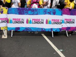
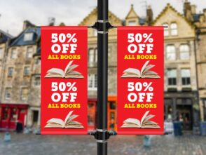
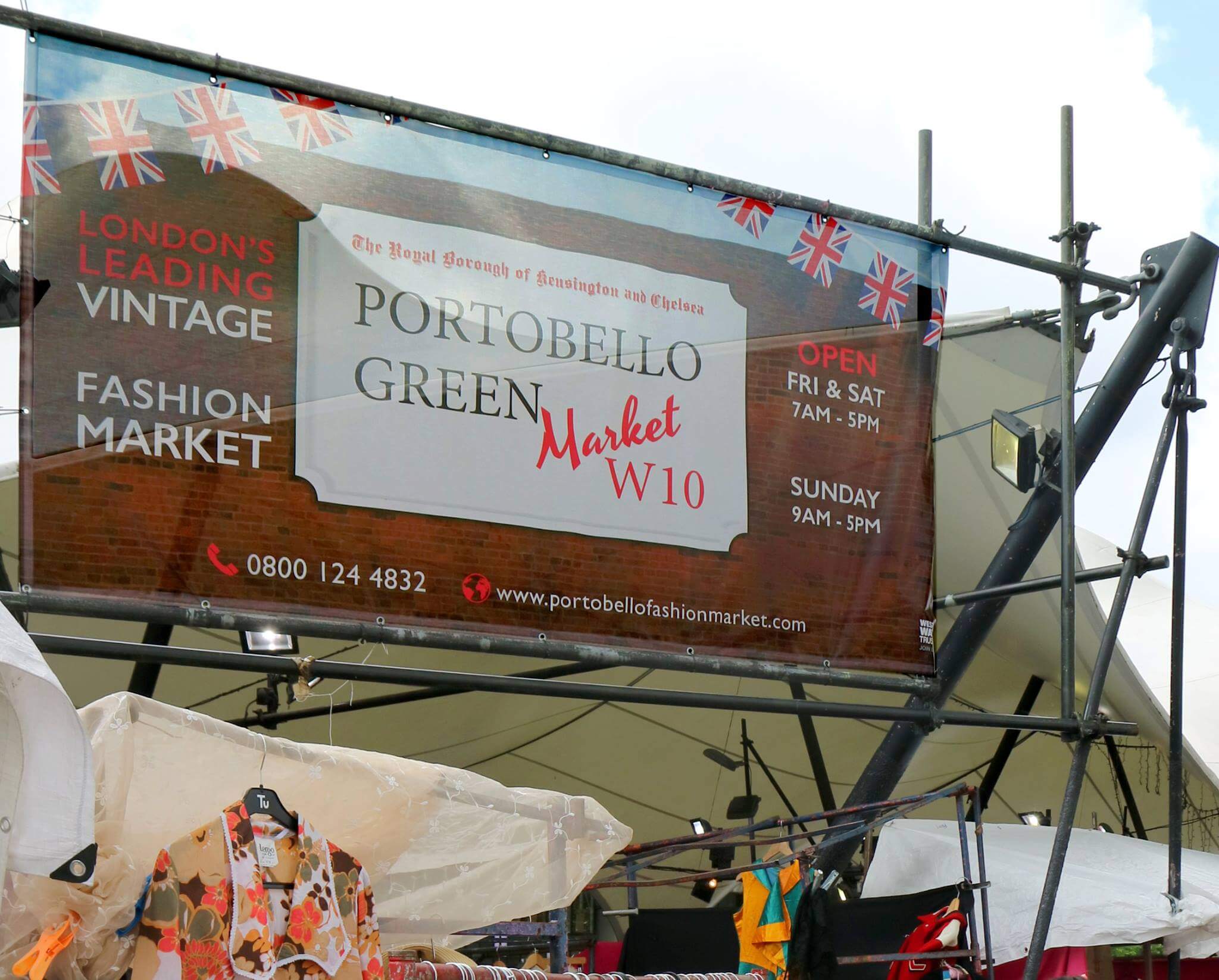
One thing that you need to bear in mind about banners (which varies from many other marketing materials such as leaflets and flyers) is that in the majority of cases, the aim is to bring attention to something which needs selling. It would help if you made sure that any material written on your banner is composed in large, easily readable text. Using small text or type that is in a hard to read font, it’s unlikely that your banner will be legible to anyone more than a few meters away.
There are many various fonts out there, and it can be appealing to choose an overly flamboyant one, but when it comes to banners, you always need to consider readability. Typically, strong sans-serif fonts will be more readable than serif or script font styles; however, this rule is not set in stone.
Offer A Basic Message
The best way to design an eyecatching banner is by keeping the message simple. Remember, less is more. Numerous effective banners are very simplistic in terms of the actual text content as the majority of function is nothing more than a few words. The reason for this is simple; banners require to communicate your message in as little time as possible as many of the target viewers don’t have time to be reading paragraphs of text (most are walking or driving by).
Try to remove anything unnecessary and communicate your message in the most basic way you can. Make sure that your banner design consists only of necessary information. To know what to include, you should consider precisely what you want to attain with your banner.
When you’re developing your banner design, you need to keep in mind the objective and include just details that are most likely to assist in bringing in leads. For example, don’t use your company address if it isn’t needed. It will over-complicate the design. Use High-Quality graphics and photos. As the goal with a lot of large vinyl banners is to draw in attention, do whatever you can to draw the focus of passers-by to your banner.
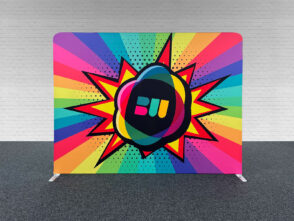
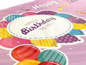
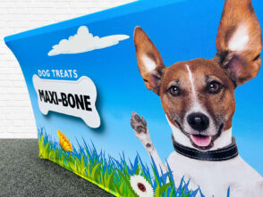
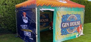
Use of Images
Images, stock photos and graphic elements can function as a focal point for your banner and therefore, will frequently attract passers-by. Not only do high-quality graphics assist in drawing attention, but they can likewise help to enhance your message and interact an emotion without the requirement for any more text.
How to choose colours
Just because a specific colour might be the brightest, it doesn’t necessarily imply it ought to be used in your banner design if it does not fit in with your existing brand name. Pick appropriate colours. Colours have different associations, and it is necessary to consider what kinds of feelings you want to evoke in your audiences.
How colours make us feel
Colours can likewise be subjective and have different associations in various cultures, so make sure to study your target audience when picking your colours. Red is associated with threat, passion, anger, enjoyment, speed, and love. Orange and yellow are the most effective colour and appealing to all audiences also understood to promote hunger. Orange is associated with vigour and happiness. Not as overpowering as red, yellow is associated with humour, sunshine, optimism, energy. Touches of yellow can capture an audience’s attention. Excessive yellow is annoying to a viewer’s eyes because it shows the most light of any colour so use sparingly. Purple has a relaxing, calming effect on an audience and is associated with luxury, royalty, overindulgence, knowledge, magic, ambition, femininity, and creativity.
We connect the colour Blue to safety, trust, clearness, serenity, intelligence, cold and masculinity. The most feminine colour is pink, which gives the feeling to love, sweet taste, womanhood, and infants. Choosing the perfect colours for your design is very important. The association for each colour is a critical factor when creating your layout.
Summary
The basic principles of designing a banner are a general rule but try and implement them into your design. Using some of the discussed principles in your design will enable your banner to translate your message better, in turn gaining more leads and creating a better return on investment.


Leave a Reply
You must be logged in to post a comment.