Effective banner design is crucial for any business or brand looking to grab attention and make an impact. A well-designed banner can be the difference between a potential customer stopping to learn more or simply walking by. The principles of good design, colour theory, typography, and images all play a role in creating an eye-catching banner that effectively communicates your message.
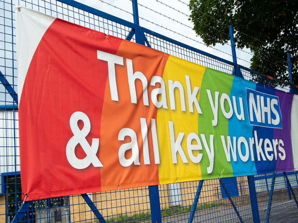
Colour is one of the most essential elements in banner design. The right colour palette can evoke emotions, create a sense of urgency, and draw attention to specific areas of the banner. Understanding colour theory and how to use it effectively can make all the difference in creating a successful banner.
Typography is another critical element in banner design. Choosing the right font, size, and spacing can make your message more readable and impactful. It’s important to remember that less is often more when it comes to typography – too many fonts or styles can make a banner look cluttered and difficult to read.
Principles of Good Design
Effective banner design requires a good understanding of design principles. Here are some fundamental principles to keep in mind:
| Principle | Description |
|---|---|
| Alignment | Elements in the design should be visually connected through alignment. This creates a sense of order and makes the banner easier to read and understand. |
| Contrast | Contrast is achieved using different colours, shapes, and sizes to create visual interest. This helps to draw the viewer’s eye to essential elements of the banner. |
| Repetition | Repeating elements in the design can create a sense of unity and consistency. This can be achieved through patterns, colours, or shapes. |
| Proportion | Proportion refers to the relationship between the different elements in the design. Elements should be sized in proportion to each other to create a balanced and harmonious composition. |
| White Space | White space, or negative space, is the area around the elements in the design. Using white space effectively can help to create a sense of balance and harmony in the banner. |
By applying these principles, you can create a banner that is visually appealing and easy to understand. Remember that effective design is not about adding as many elements as possible but rather about using the correct elements correctly to achieve your desired outcome.

Colour Theory
Colour plays a crucial role in banner design. It can evoke emotions, convey messages, and create a visual hierarchy. Understanding colour theory is essential to create an eye-catching banner that effectively communicates with your target audience.
When choosing colours for your banner, consider the following:
- Colour psychology: Different colours can evoke different emotions and feelings. For example, red can create a sense of urgency, while blue can convey trust and reliability. Make sure to choose colours that align with your brand and message.
- Contrast: High-contrast colours can make your banner stand out and grab attention. Use contrasting colours for your text and background to make your message clear and easy to read.
- Colour harmony: Choose colours that work well together to create a cohesive and harmonious design. Use tools like the colour wheel to find complementary or analogous colours.
It’s also important to consider the cultural and regional connotations of colours. For example, in Western cultures, white is associated with purity and innocence, while in some Eastern cultures, it can represent mourning and death. Make sure to research and understand the cultural context of your target audience to avoid any unintended misinterpretations.
Overall, colour is a powerful tool in banner design. By understanding colour theory and using it effectively, you can create an attention-grabbing banner that communicates your message and resonates with your target audience.
Typography
Effective typography is crucial for creating a banner that is both eye-catching and easy to read. Here are some tips to keep in mind when designing your banner:
- Choose a font that is easy to read from a distance. Sans-serif fonts like Arial or Helvetica work well for banners.
- Use a large font size to ensure your message can be read from a distance. A good rule of thumb is to use a font size of at least 50mm tall.
- Keep your message short and to the point. Use concise language and avoid cluttering your banner with too much text.
- Use contrast to make your text stand out. Choose a font colour that contrasts with your background colour. For example, white text on a dark background or black text on a light background.
Remember that typography is just one element of effective banner design. Be sure to consider the overall layout, colour scheme, and use of images when designing your banner.
Use of Images
Using images in your banner design can greatly enhance its visual appeal and make it more eye-catching. However, it’s essential to use images that are relevant to your message and are of high quality. Here are some tips for using images effectively in your banner design:
- Choose images that are high-resolution and clear. Blurry or pixelated images can make your banner look unprofessional.
- Use images that are relevant to your message and target audience. For example, if you’re promoting a fitness product, use images of people exercising or being active.
- Avoid using too many images in your banner. This can make it look cluttered and confusing.
- Consider using a single large image as the background of your banner and overlaying text and other elements on top of it.
- Use contrasting colours between your images and text to make them stand out.
Remember that the images you use in your banner should be there to support your message, not distract from it. Keep your design simple and focused on your main message, and use images sparingly and strategically to enhance its visual appeal.
Conclusion
Creating an effective banner design requires a combination of good design principles, colour theory, typography and images. Following these tips, you can create an attention-grabbing banner that effectively communicates your message to your target audience.
Remember to keep your design simple and consistent with your brand. Choose colours that complement each other and use typography that is easy to read. Use high-quality images relevant to your message, and avoid using low-quality images that can make your banner look blurry or grainy.
Make sure to consider the placement of your banner, whether indoors or outdoors, and the distance from which it will be viewed. This will help you determine the appropriate size and resolution for your banner.
Finally, always test your banner design before printing or publishing it. Show it to a focus group or get feedback from colleagues to ensure that it effectively communicates your message and grabs the attention of your target audience.
By following these principles and tips, you can create an effective banner design to help you achieve your marketing goals and stand out.


Leave a Reply
You must be logged in to post a comment.