Banner viewing distances explained and best dpi for banner sizes. In the world of PVC banner printing, understanding the various factors that impact banner visibility is essential to ensure an effective and eye-catching display. One such factor is the viewing distance, which plays a significant role in determining the appropriate dpi (dots per inch) of a printed banner. It’s crucial to consider the distance at which a banner will be viewed when deciding on dpi, as this can impact the overall legibility and appearance of the design.
For smaller banners up to 5 square meters, a dpi between 100-125 is generally recommended. These banners are typically viewed at closer distances, making higher-resolution images desirable. As banner sizes increase, the ideal dpi tends to decrease. Banners between 5 and 50 square meters usually require a dpi between 50-100, while those over 50 square meters can benefit from a dpi as low as 30-50. This reduction in dpi as banner size increases is because the pixelation and lower-resolution images are less noticeable when viewed from greater distances.

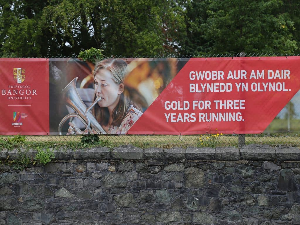
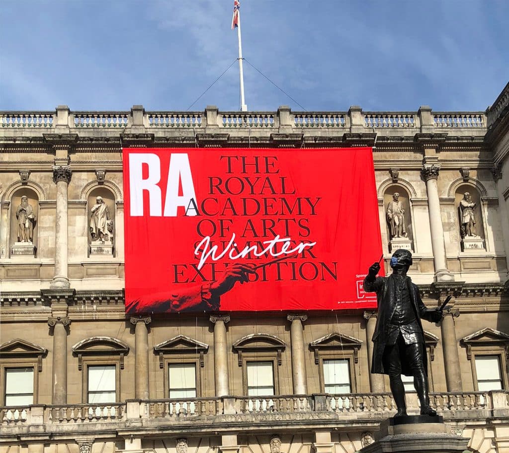
Additionally, the viewing distance of a banner can vary widely based on its location and purpose. For example, a banner mounted in a disused trailer in a farmer’s field next to the motorway could be seen from over 200 feet away, allowing for a much lower dpi to be used without sacrificing legibility. In contrast, banners utilised for birthday parties or market stalls may be viewed from a mere 3-4 feet away, making higher dpi a necessity. Another essential factor to consider is the text size of the banner. Larger text is generally required for readability at distances of 200-300 feet, and font styles that are easily legible are preferred. When designing banners for long-range viewing, keeping the message simple and using less text for greater impact is crucial, considering that individuals may see the banner in passing vehicles or trains.
Understanding Banner Viewing Distance and DPI
Significance of DPI for Different Banner Sizes
When it comes to banner printing, the viewing distance plays a crucial role in determining the appropriate DPI (dots per inch) for different sizes of banners. DPI refers to the number of printed ink dots per square inch for a given image.
Small Banners (up to 5 square meters)
For smaller banners measuring up to 5 square meters, it’s recommended to maintain a DPI between 100 and 125. This provides adequate image quality for close-up viewers while keeping pixelation minimal.
Medium Banners (5 square meters to 50 square meters)
As banner size increases, so does the typical viewing distance. For banners from 5 square meters to 50 square meters, the optimal DPI can range between 50 and 100. The lower DPI might cause a slight decrease in image quality, but it will not be noticeable when viewed farther away.
Large Banners (over 50 square meters)
For large banners exceeding 50 square meters, DPI can be reduced even further to 30-50. The size of such banners requires a significant viewing distance, and consequently, the lower DPI will not affect the viewer’s experience.
Comparing Banners for Various Viewing Distances
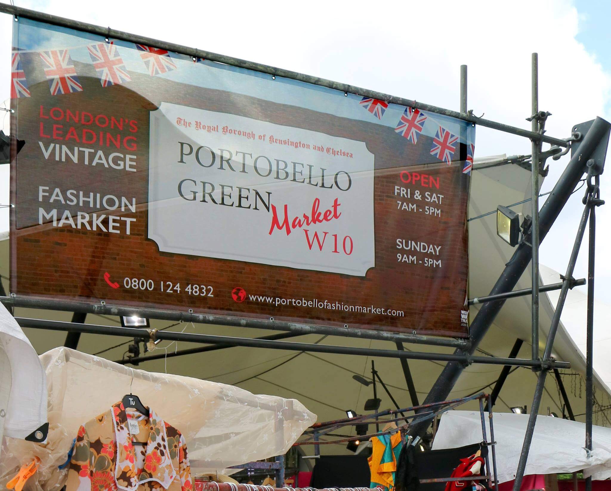
The intended use of the banner also impacts DPI requirements. For instance, a banner mounted next to a motorway will have an average viewing distance of 200+ feet. A lower-quality DPI is suitable in this case, as the farther viewing distance compensates for lower-resolution images.
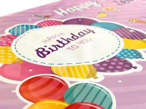
On the other hand, a banner meant for a birthday party or a market stall might have a viewing distance of just 3-4 feet. For these situations, a higher DPI (100-125) is advisable to maintain image sharpness at close distances.
Text Size and Readability
For text to be readable from 200-300 feet away, choosing the right font size and style is essential. Large, simple, and bold fonts are more readable from a distance. In addition, limiting the amount of text on the banner will make it easier for passersby to process the information quicker, especially if they move quickly in a car or train.
When creating large banners aimed at distant viewers, it’s essential to remember that less is more. Avoid overloading the banner with too much text, and instead, focus on delivering a clear and concise message.
In conclusion, understanding the relationship between banner size, viewing distance, and DPI is essential for creating effective and visually appealing banners. By considering these factors, you can ensure that your banners are optimally designed for their intended purpose and audience.
Effects of Banner Viewing Distance on Resolution and Pixelation
Choosing the right font style is equally important for ensuring the legibility of a banner from a distance. Opt for clear, readable font styles over decorative, intricate designs. Simple fonts will make it easier for viewers to grasp the message quickly, regardless of the banner’s size or distance.
Sticking to the “less is more” principle can also benefit large banners. Rather than filling the space with excessive text, prioritising a concise message with fewer words can create a more significant impact, especially targeting viewers who may be passing quickly.
In summary, when discussing the effects of viewing distance on PVC banner resolution and pixelation, it is essential to consider factors such as:
- The appropriate DPI for the banner’s size
- Font size and style for readability at various distances
- The importance of maintaining simplicity and brevity for maximum impact
By considering these factors, one can create effective and visually appealing banners for various viewing distances while optimising the resolution and readability of the graphics and text.
Comparing Different Banner Viewing Distances Scenarios
Large Outdoor Banners
Large outdoor banners, such as those mounted onto a high-up on a building, may have a viewing distance of over 100 feet. As the viewer is further away, the importance of a high dots per inch (dpi) value decreases. For banners larger than 50 square meters, a dpi of 30-50 is sufficient, as pixelation and lower-resolution images are less noticeable at greater distances.
To ensure that text is readable is good at greater distances, it is crucial to consider the appropriate font size and style. A general rule to follow is for every 1 inch of text height; it provides 10 feet of readability. For example, a text height of 20 inches would be readable from 200 feet away. Selecting a clear and readable font style becomes essential in this scenario so that the viewer can easily comprehend the message on the banner. Additionally, including less text with larger font size on large banners increases the overall impact, especially for viewers passing by in a vehicle.
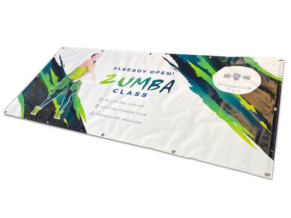
Small Personalised Banners
Small personalised banners, such as those used for birthdays or market stalls, have a much closer viewing distance, typically around 3-4 feet. A higher dpi between 100-125 is recommended for small banners up to 5 square meters as the viewer is nearby. For banners between 5 and 50 square meters, a dpi ranging from 50-100 may be appropriate.
Like large outdoor banners, font size and style are essential to ensure readability at close distances. However, small personalized banners might include more detailed text or design elements, as the viewer has a better opportunity to examine the banner at close range. In these cases, adjusting the font size for different parts of the banner and choosing readable font styles remains crucial for effectively communicating the message.
In summary, it is essential to consider the viewing distance when designing banners and selecting the appropriate dpi, font size, and styles for various scenarios. Low dpi and larger, clear fonts are effective for large outdoor banners viewed at greater distances. On the other hand, small personalised banners require higher dpi and a combination of font sizes and styles for optimal readability at close distances.
Readability and Text Sizes for Viewing Banners at Distance
When designing a PVC banner, it’s essential to consider the banner’s location and intended viewing distance. The viewing distance greatly affects text size and font choice, ensuring the message is effectively conveyed to the audience.
Optimal Text Sizes for Different Banner Viewing Distances
To make text readable from different distances, follow these general guidelines concerning text size and legibility:
- For banners aimed at drivers or other moving viewers, the text must be large enough to be easily noticeable and readable. A rule of thumb is to use letter heights of 10 to 12 inches for every 100 feet of viewing distance. For example, if the banner is to be seen from 200-300 feet away, opt for a letter height of 20 to 36 inches.
- A smaller text size will suffice for banners placed close to the audience, such as at birthday parties or market stalls. As a general guideline, a 16pt font size works for a viewing distance of 4 feet.
Choosing the Right Font Style
The choice of font style is equally important in determining the readability of text from a distance. Avoid using fancy or intricate fonts, as these can be difficult to read from afar. Instead, opt for simple, clean, and easily readable font styles like Arial, Helvetica, or Times New Roman.
Key Considerations for Banner Design
When designing banners for distant viewing, keep the following points in mind:
- For large banners aimed at moving viewers, like those by the motorway or train tracks, use fewer words and larger font sizes. Allow the message to be quickly absorbed while minimising the risk of losing the viewer’s attention.
- Optimise DPI (dots per inch) based on the viewing distance. Smaller banners can maintain a higher DPI between 100-125, while larger banners with distances between 5-50 square meters can have DPI as low as 50-100. For banners greater than 50 square meters, a DPI of 30-50 should suffice.
- Reduce the visual clutter on the banner by avoiding excessive images, and logos, ensuring that the text remains highly visible and easier to decipher from a distance.
- Choose colours that strongly contrast the background and text, such as black on white or vice versa, to improve visibility.
Following these guidelines ensures the message is communicated to the intended audience, regardless of the viewing distance. You can create impactful and effective PVC banner designs by considering factors such as text size, font style, and content.


Leave a Reply
You must be logged in to post a comment.