Protest signs can be an effective way to get your message out and thought about by those who are passing by. When done right, they can also be a powerful tool for mobilising people toward action. However, protest signs need to be used carefully to have the greatest impact.
If you’re planning on using protest signs or banners as part of your grassroots campaign, here are some helpful hints that will help you create the most impact with the least amount of effort.
“Making a sign and showing up to a protest is an act of saying that you matter and your voice should be heard. I don’t think it matters if it’s funny or original or not, it just matters that you’re there saying it.”
How to use protest signs to help your cause
1. Make your message clear and concise
Use simple words and short sentences with one or two key points that are easy to understand, no matter who is looking at the sign.
2. Be creative
It doesn’t have to be a slogan or clever saying; in fact, many people prefer a plain protest banner because it’s more approachable. Don’t let this deter you from being creative though! There are lots of ways to stand out with a creative banner that still speaks to your cause.
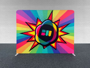
3. Utilise colour
Colour is one of the most powerful tools for making your banner stand out and grab attention. It’s also important for grabbing attention in low-light conditions (or bright daylight). Remember: your message needs to be read – so use colour effectively!
Content
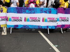
A protest sign’s message must be explicit. It needs to convey the tone to onlookers and have a clear message. Just one protest sign’s message can determine whether someone leaves the demonstration in disgust, takes a photo to post on social media, or even decides to participate. In light of this, comedy can occasionally be one of the most impactful elements to include on a protest sign, but if misused, it can actively push people away. Similar to how a friendly call to action will change the atmosphere of your event, a message of inclusion will. It is critical that they reflect thinking in their content and aren’t just thrown together.
Readability
Draw a rough draught of the text that will appear on your sign. Your statement should be as succinct as possible, using as few words as possible to give room for huge fonts. The wording on your sign should be presented in a way that allows it to be read from a distance, whether it is printed or done by hand.
Posters with text have the most impact when the colour scheme is restricted. Even if the background is vibrant, your main content should always be well-contrasted against it. Effective crowd-surfing communication requires the use of kerning. You might as well not be holding a sign at all if someone can’t read it because you ran out of room and jammed a lot of letters together. Check your poster’s readability by moving far enough away to read it. Have you had to strain your eyes to read it?
Colour
When attempting to catch someone’s attention, some colours go particularly well together. For instance, orange and blue are frequently used together on movie posters because they are viewed as “complementary” or “opposite” hues and help one another stand out.
Another technique to choose colours efficiently is to imitate the designs of traffic signs and other indicators that are known to draw attention. For example, highlighting white-on-red, black-on-yellow, and black-on-orange are all likely to draw attention from onlookers.
If you choose to utilise colours other than black, be cautious to avoid using too light of hues. Pink and yellow will be quite challenging to read.
How we make protest signs
First, decide what your message is, really think about the message you wish to share.
When making a sign, always refer to the font you are using for the text. If you want it to read in a certain way, make sure that typeface matches. Second, plan out how large your sign will be.
If your protest is going to be on a busy street corner, it’s important to plan out how wide the sign will be so that people won’t accidentally walk into it. You don’t want anyone getting hurt or getting hit by your sign and hurting themselves.
The most important thing with protest signs is planning them out (especially if you want people to pay attention). This will ensure that they are as effective as possible and that they get noticed!
Once you have the vision of your design, you can submit it us using our online designer, or if you prefer, and are already a professional designer, you can use the adobe creative suite.


Leave a Reply
You must be logged in to post a comment.