Event banners can make or break the success of a promotional effort, yet many organisers struggle with getting the basics right. From choosing the wrong size for the venue to placing banners where no one can see them, small mistakes can waste money and miss opportunities to connect with attendees. The most effective event banners combine proper sizing for the space, strategic placement for maximum visibility, and clear design that people can read from a distance.
Getting banner sizing and placement right requires understanding a few key principles. The size of a banner should match both the venue and the viewing distance. A banner that works well at an intimate indoor gathering will likely be too small for an outdoor festival where people view it from far away.
Placement matters just as much as size. A perfectly designed banner does little good if it sits in a corner where foot traffic is light or if it competes with too many other visual distractions. Smart placement takes into account how people move through a space, where they naturally look, and what will catch their attention without overwhelming them.
Key Takeaways
- Choose banner sizes based on viewing distance and venue type to ensure your message reaches attendees effectively
- Place banners along natural pathways and at eye level where they capture attention without causing visual clutter
- Use readable fonts, high-contrast colours, and simple designs that communicate your message within seconds
Understanding Banner Sizing for Events
Getting banner dimensions right affects visibility, readability and response rates at any event. The size must match the venue space and viewing distance whilst fitting the event’s purpose.
How to Determine the Right Banner Size
The viewing distance determines the minimum banner size needed. For every metre of viewing distance, text height should be at least 2.5cm to remain legible. A banner viewed from 10 metres away needs letters at least 25cm tall.
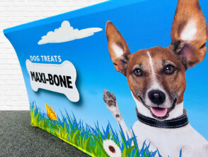
Event type influences size selection. Trade shows typically work well with pull-up banners at 2m x 0.85m, whilst outdoor festivals need larger formats like 3m x 1m or 6m x 2m. Indoor venues with limited space suit smaller banners between 1.2m to 2m wide.
The message complexity also matters. Banners with detailed information need larger dimensions to maintain readable text sizes. Simple logos or short slogans work effectively on compact sizes.
Available mounting points restrict size choices. Check ceiling heights, wall space and ground clearance before finalising dimensions.
Standard Banner Sizes and Custom Options
Common UK banner sizes include 2m x 0.8m for roller banners, 3m x 1m for outdoor events, and 6m x 2m for building facades. The 3m width offers a strong balance between impact and practicality for most events.
Standard vinyl banner dimensions are:
- 2m x 0.8m – Pull-up and roller banners
- 2.4m x 1.2m – Small outdoor banners
- 3m x 1m – Medium outdoor displays
- 4m x 2m – Large venue banners
- 6m x 3m – Building wraps
Custom sizes accommodate unique venue requirements. Non-standard dimensions cost more but solve specific placement challenges. Most suppliers print banners in 0.3m increments.
Considering Viewing Distance and Venue Space
Indoor venues require different sizing than outdoor spaces. Ceilings, doorways and furniture limit banner placement indoors. Measure the clear wall height and width available before ordering.
Outdoor banners face wind exposure and longer viewing distances. A banner on a building needs visibility from across streets, requiring larger text and simpler designs. Wind resistance increases with size, so proper mounting becomes critical above 3m widths.
Crowd density affects optimal height placement. Dense crowds need banners mounted at 2.5m or higher to clear heads. Sparse audiences allow lower positioning at 1.5m to 2m, which supports smaller sizes whilst maintaining visibility.
Selecting the Ideal Banner Material
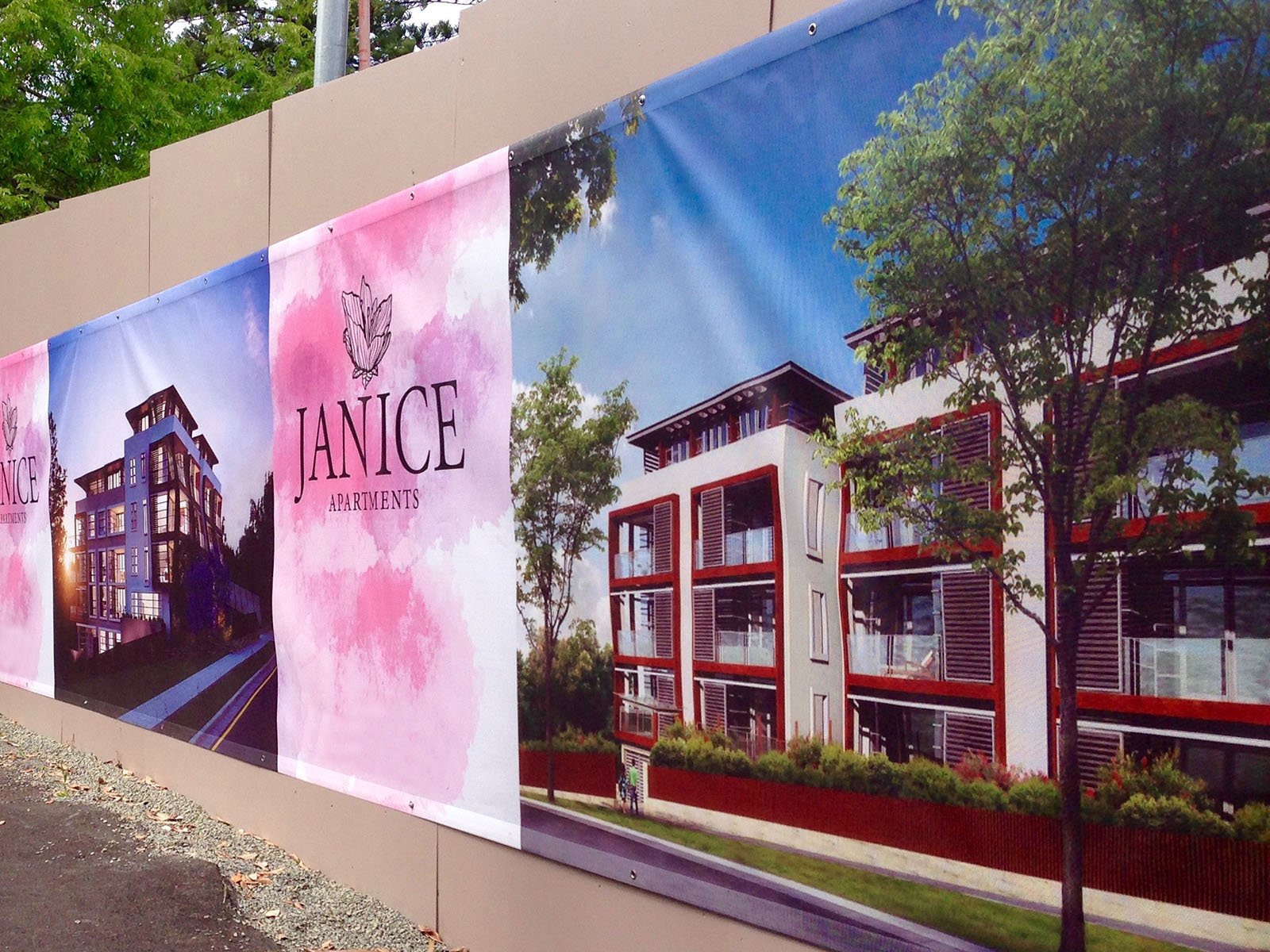
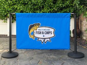
The material choice directly affects a banner’s performance, longevity and suitability for different environments. Vinyl delivers weather resistance for outdoor events, fabric creates professional indoor displays and mesh handles wind whilst maintaining visibility.
Vinyl Banners: Durability and Outdoor Use
Vinyl banners stand as the most popular choice for outdoor events due to their weather-resistant properties. This material withstands rain, wind and sunlight without fading or deteriorating quickly.
The construction involves PVC film, often with polyester scrim reinforcement for added strength. Most vinyl banners feature a coating process that bonds layers together more securely than laminated alternatives. This creates a durable product that lasts through multiple events.
Key advantages include:
- Water resistance for protection against rain
- UV stability preventing colour fade
- Tear resistance for high-traffic areas
- Easy cleaning with simple soap and water
Vinyl works particularly well for outdoor festivals, sporting events and long-term promotional displays. The material accepts vibrant printing whilst maintaining durability. Standard weights range from 340gsm to 510gsm, with heavier options providing increased wind resistance.
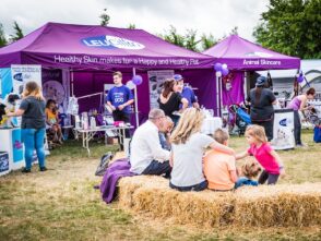
Fabric Banners for Indoor Impact
Fabric banners deliver a premium appearance for indoor events where presentation matters most. The textile construction eliminates glare under indoor lighting, creating better readability than reflective vinyl alternatives.
These banners drape naturally without curling at the edges. The wrinkle-resistant properties mean they pack flat for transport and hang smoothly without creases. Fabric also weighs less than vinyl, making installation easier and reducing shipping costs.
The material produces richer colours with better ink absorption than vinyl. This quality makes fabric ideal for conferences, trade shows and corporate events where brand representation matters. Most fabric banners are machine washable, allowing for repeated use across multiple events.
The main limitation involves outdoor durability. Fabric performs poorly in wet conditions and fades faster under direct sunlight than vinyl options.
Mesh Banner Applications
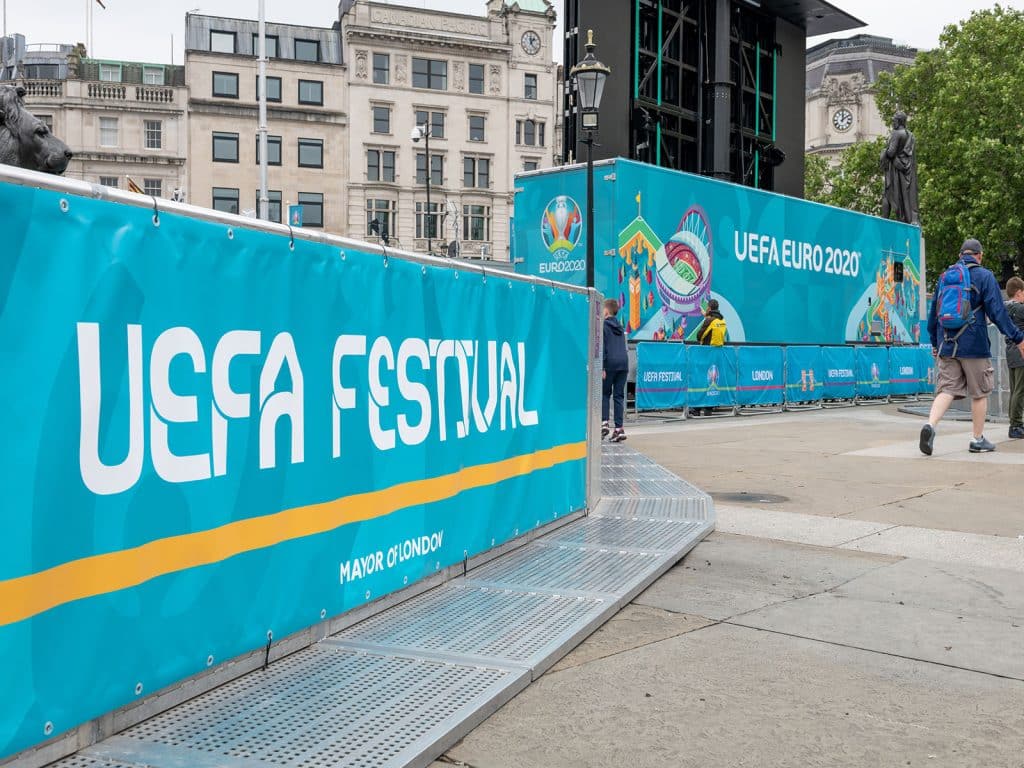
Mesh banners feature a perforated design that allows wind to pass through the material. This construction reduces wind resistance by approximately 30-50%, making them essential for exposed locations.
The tiny holes in mesh banner material prevent the sail effect that tears solid banners in windy conditions. This design works perfectly for fence installations, building wraps and outdoor venues with consistent wind exposure.
Print quality appears slightly less sharp than solid vinyl due to the perforations. However, modern mesh materials with finer weaves minimise this difference whilst maintaining wind resistance. The material suits large format applications where viewing distance compensates for any detail loss.
Mesh combines vinyl’s weather resistance with practical wind management. Events near coastlines, on rooftops or in open fields benefit most from this material choice.
Best Practices for Banner Placement at Events
Proper banner placement requires understanding traffic flow, sight lines, and environmental factors that affect visibility. The right location combined with attention to physical obstructions and lighting conditions ensures attendees notice and engage with event messaging.
Strategic Placement for Maximum Visibility
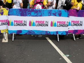
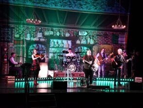
Event organisers should position banners at key decision points where attendees naturally pause or change direction. Entrances, registration areas, and queuing zones offer high dwell time for message absorption. Banners work best when placed perpendicular to foot traffic rather than parallel, allowing visitors to see them head-on as they approach.
Height matters significantly for visibility. Banners mounted at eye level (1.5 to 1.8 metres) perform best in crowded spaces. For outdoor events or large venues, elevated placements of 2.5 to 3 metres help messages stand out above crowds.
Consider placing multiple banners along the attendee journey rather than clustering them in one location. This repetition reinforces messaging and accommodates different entry points. High-traffic intersections and directional change points create natural viewing opportunities.
Corners and wall-adjacent spaces often go unused but provide excellent positioning. These locations don’t obstruct movement whilst capturing attention from multiple approach angles.
Avoiding Obstructions and Enhancing Readability
Physical barriers reduce banner effectiveness dramatically. Organisers must survey placement locations for columns, furniture, equipment, and temporary structures that block sight lines. Even partial obstructions diminish readability and professional appearance.
Crowd density affects viewing angles throughout an event. What appears clear during setup may become blocked when attendees gather. Position banners above typical crowd height or in less congested zones to maintain visibility.
Distance determines readable text size. A banner viewed from 3 metres requires minimum text heights of 2.5 centimetres, whilst 10-metre viewing distances need 7.5-centimetre letters. Test readability from multiple distances and angles before finalising placement.
Wind and movement create readability challenges for hanging banners. Secure all corners and edges properly, or choose rigid mounting systems for outdoor locations. Excessive movement makes text difficult to read and appears unprofessional.
Lighting and Environmental Considerations
Natural and artificial lighting dramatically affects banner visibility throughout the day. Morning sun creates glare on east-facing banners, whilst afternoon light may cast shadows that obscure messaging. Site visits at various times identify problematic lighting conditions.
Indoor venues require assessment of overhead lighting, spotlights, and ambient light levels. Banners placed in dimly lit corners or shadowed areas lose impact. Position them where existing lighting naturally highlights the display, or arrange supplementary lighting.
Reflective and glossy banner materials create glare problems under direct lighting. Matte finishes work better in brightly lit environments or outdoor settings with strong sunlight. Material choice should match the specific lighting conditions of each placement location.
Weather protection extends banner lifespan and maintains appearance. Outdoor placements need waterproof materials and secure mounting that withstands wind. Rain, direct sunlight, and temperature fluctuations all affect banner condition and readability over multi-day events.
Optimising Banner Design for Readability
Clear, readable banners communicate messages quickly and effectively to event attendees. Strong design choices in simplicity, typography, and image quality determine whether viewers engage with or ignore a banner.
Applying the ‘Less Is More’ Principle
Event banners compete for attention in busy environments. A cluttered design overwhelms viewers and dilutes the message. The most effective banners contain only essential information: a clear headline, key details, and a call to action.
Designers should limit text to 10 words or fewer when possible. Short phrases stick in viewers’ minds better than lengthy explanations. Each element on the banner must serve a specific purpose.
White space plays a crucial role in banner design. Empty areas around text and images give the eye places to rest. This spacing makes information easier to process at a glance.
Font Selection and Layout Tips
Font choice directly impacts how quickly people read a banner. Sans-serif fonts like Arial or Helvetica work best for banners because they remain legible from a distance. Decorative or script fonts slow down reading and reduce comprehension.
Text size matters enormously. The minimum font size should be 2.5cm tall for every 3 metres of viewing distance. Larger text ensures readability across various distances at events.
Recommended text hierarchy:
- Headline: Bold, 200-300pt
- Subheading: Medium weight, 100-150pt
- Body text: Regular weight, 60-80pt
Contrast between text and background determines readability. Dark text on light backgrounds or light text on dark backgrounds provides the clearest visibility. Avoid placing text over busy background images.
Use of High-Resolution Images
Pixelated or blurry images damage credibility and make banners look unprofessional. High-resolution images maintain clarity when printed at large sizes. Event banners require images with a minimum resolution of 150 DPI at actual print size.
Images larger than needed work better than upscaling smaller files. A photograph that looks sharp on a computer screen may appear grainy when enlarged to banner dimensions. Designers should source images at the largest available size.
File formats matter for image quality. Vector graphics (AI, EPS, SVG) scale infinitely without losing quality. Raster images (JPG, PNG) need sufficient pixel dimensions from the start. Images pulled from websites rarely contain enough resolution for print banners.
Colour and Branding Strategies
The right colour choices and consistent branding elements can make an event banner significantly more effective at attracting attention and communicating the intended message. Strategic use of colour psychology and brand consistency helps create memorable impressions that align with marketing goals.
Using Colour Psychology Effectively
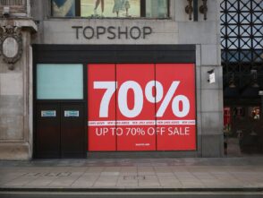
Different colours trigger specific emotional responses and behaviours in viewers. Red creates urgency and excitement, making it ideal for promotions or clearance events. Blue conveys trust and professionalism, which works well for corporate gatherings or financial services events.
Yellow captures attention quickly and communicates optimism. Green represents growth and health, suitable for environmental or wellness events. Orange combines energy with approachability for friendly, casual settings.
Designers should consider their target audience when selecting colours. Younger audiences often respond to bright, bold colour schemes. Professional audiences typically prefer subdued, sophisticated palettes.
Cultural context matters significantly. White symbolises purity in Western cultures but represents mourning in some Eastern traditions. Research the audience’s cultural background before finalising colour choices.
Consistent Branding Across Marketing Materials
Event banners must match the visual identity established across all marketing materials. This includes using the exact brand colours, official logos, and approved typefaces. Consistency builds recognition and reinforces brand credibility.
The banner should reflect the same design language as websites, social media posts, brochures, and email campaigns. When attendees see familiar brand elements, they immediately connect the banner to previous interactions with the organisation.
Brand guidelines typically specify minimum logo sizes, spacing requirements, and colour variations. Following these standards prevents dilution of brand identity. Maintaining consistent margins and layout structures across different banner sizes creates a cohesive appearance at multi-banner events.
Contrasting Colours for Impact
High contrast between text and background ensures readability from long distances. Dark text on light backgrounds or light text on dark backgrounds provides maximum legibility. Avoid combinations like yellow text on white or dark blue on black.
Complementary colours on the colour wheel create natural contrast. Blue and orange, purple and yellow, or red and green pairs draw the eye effectively. These combinations make key information stand out without overwhelming viewers.
The 60-30-10 rule helps balance contrast. Use the dominant brand colour for 60% of the design, a secondary colour for 30%, and an accent colour for 10%. This creates visual interest whilst maintaining cohesion.
Test banner designs at actual viewing distances before printing. What appears readable on a computer screen may lack sufficient contrast when viewed from several metres away.
Tailoring Banners to Specific Event Types
Different events demand different banner approaches. The venue environment, audience behaviour, and event format all influence which banner specifications will perform best.
Indoor Versus Outdoor Events
Outdoor banners need vinyl or mesh materials that resist wind, rain, and UV exposure. Vinyl works for most outdoor applications, whilst mesh allows wind to pass through, reducing stress on mounting points during storms. These materials typically last 2-3 years in outdoor conditions.
Indoor events allow lighter materials like fabric or standard vinyl. Fabric banners reduce glare under artificial lighting and create a more polished appearance for corporate settings. They’re also quieter when air conditioning causes movement.
Weather protection determines finishing choices. Outdoor banners require reinforced hems and rust-proof grommets placed every 60-90 cm. Indoor banners can use pole pockets or simpler hanging systems since they face no weather stress.
Trade Shows, Festivals, and Corporate Functions
Trade show banners must stand out in crowded exhibition halls. Retractable banners work best here, sized at 85 cm × 200 cm for individual stands or 200 cm × 200 cm for backdrop walls. They need bold graphics visible from 3-5 metres away.
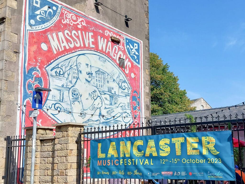
Festival banners require larger formats to compete with crowds and activity. Sizes of 3-6 metres wide suit festival entrances or sponsor displays. High mounting positions (3+ metres) keep them visible above crowds. Bright colours and minimal text work better than detailed information.
Corporate functions call for subtlety and brand consistency. Banners at these events typically measure 1-2 metres wide. They use company colours and professional fonts. Multiple smaller banners often work better than one large banner, allowing placement at registration desks, stages, and networking areas.
Selecting Banner Shapes and Mounting Options
Rectangle banners suit most applications and cost less to produce. Standard sizes like 2 m × 1 m or 3 m × 1 m fit common frame systems and mounting hardware.
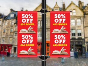
Teardrop and feather flags create movement that attracts attention outdoors. They work well for directional signage or marking event perimeters. Heights range from 2.5 m to 5 m, with larger sizes for car parks or field events.
Mounting methods vary by location. Wall-mounted banners use grommets and zip ties or banner tape. Freestanding banners need weighted bases or ground stakes. Hanging banners require ceiling hooks or tension cable systems rated for the banner’s weight plus 50% safety margin.

Leave a Reply
You must be logged in to post a comment.